
SCBWI-Nevada’s Illustrator Intensive took place virtually in November 2021 with Senior Art Director Mallory Grigg of MacMillan Books for Young Readers. I registered because I wanted to hone character design and visual storytelling skills and to get a feel for what it’s like to work with an art director.
After registering, in
August I received two options for the assignment:
• create a PB dummy with
the manuscript provided, or
• design a YA cover for
The Great Gatsby.
I chose the PB dummy.
The assignment had two deadlines/parts:
- PART 1) Develop the
characters, choose a trim size and create a loose dummy due in 5 weeks.
(mid-September)
- PART 2) After receiving
feedback (mid-October) on initial sketches, tighten the dummy and take two
spreads to full color, due in November for the Intensive Virtual Workshop.
It was a considerable challenge. What follows are my steps and take-aways.
PART 1: BRAINSTORMING - CHARACTERS - INITIAL COLOR - SIZE/THUMBNAILS - PACING
BRAINSTORM
Consider
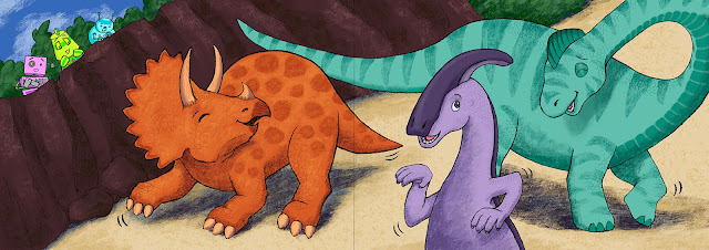
all possibilities. The manuscript featured robots and dinosaurs. I considered:
1. literally robots and
dinosaurs
2. kids dressed as robots
and dinosaurs
3. toys
I went with literal robots and dinosaurs because that would be the most fun for me to illustrate, but I kept the “toys” idea as a final reveal because I really liked playing with the story that way.
READ BETWEEN THE LINES
Mallory’s manuscript left a lot open for illustrators to define. There was a hint at music, putting on a show, creativity, and friendship, so there was plenty to figure out in terms of developing those themes.
CHARACTER DESIGN
Steps and decisions:1. Research and sketching
a LOT brings the characters to life. Knowing them from all angles &
emotions is a huge asset before starting a dummy.
2. I kept the number of
characters to a minimum: 3 robots - square, triangle, and circle-based, and 3 dinosaurs
with varying shapes.
3. Character lineups help
define size and color relationships.
4. Simplifying characters
avoids burnout, but do season with interesting detail.

INITIAL COLOR

SIZE/THUMBNAILS
Characters/topic will help define page size. I based my trim size on a PB by Steve Light - I wanted a large landscape to hold large dinosaurs. The size defined my thumbnail ratios, and I created a template for the dummy thumbnails using InDesign. I have a few different thumbnail templates on my website’s resources page for anyone to download.
PACING
The text provided would’ve fit neatly into 32 pages, but considering uneven sections, and a wordless spread/pause gave me the ability to add more interest and an end reveal.PART 2: FEEDBACK- COLOR/VALUE STUDIES - FLOW - BACKGROUNDS - LEAVING ROOM FOR TEXT - FINAL ART & THE VILLAGE
Overall, the feedback I received was positive. Mallory liked my perspectives and wanted me to push the characters a little more, such as adding expressive eyebrows to robots, and to explore a completely different color story. She suggested 80’s neon for the robots, and I loved that idea. It was fantastic to have Mallory’s input to move forward.
COLOR/VALUE STUDIES
In order for my characters to work well in the composition, I did some value studies, and then tried new colors for the characters. The values didn’t always translate, but it did help me see shape placement.

FLOW
Images should flow from left to right to guide the reader to the next page. I know this, yet my characters don’t always want to go in the direction of the page turn. Mallory pointed out the following page, which needed to flip, and I made that change.

LISTEN TO YOUR GUT
The following spread was also recommended to be flipped. But after trying it, my gut told me to keep it this way, so that the readers land on those sad robots before the page turn.

BACKGROUNDS
I love characters, and backgrounds have been a challenge for me. Thinking of the background as a character sometimes helps, but in this case, I used the backgrounds as design elements and composition footholds. I removed a drawing of a shrub with hibiscus flowers on it because it was too interesting and detracted from the characters, especially in this character relationship story.
ROOM FOR TEXT AND GUTTER
I learned not to get too far finished with a drawing until I knew that compositionally it worked with the amount of text for that page. I did my own text layout in InDesign, and some pages needed illustration edits to make room for text.
Mallory told us that gutter size depends on trim size and page count, but to plan on a half inch to an inch for the gutter.
FINAL ART & THE VILLAGE
While knee-deep in final art, adding details like checkerboard teeth kept it FUN!
The day of the virtual intensive itself Mallory critiqued all of our dummies on the spot. There was a lot to learn.


My two biggest
take-aways:

- Books are a
collaborative creation. Listening to feedback, trying new things, and
communication are essential. What can you bring to the story to add dimension?
Thanks to SCBWI
Nebraska’s Illustrator Coordinator Chloe Burgett who did a ton of work organizing this productive event, and to Mallory Grigg for her insights and
critiques.

Kara Marsee is an
author/illustrator living in Ann Arbor with her family and house rabbit. She
serves SCBWI-MI as one of the Communications Co-Coordinators, and she works in
the office of a public elementary school. Kara loves the challenge of creating
dummies, as well as drawing personalities and animals. When she’s not drawing, writing, or reading, you can
find Kara volunteering for a literacy program, practicing yoga, hiking, or
enjoying a warm cup of tea and sudoku/colorku.
Website: karamarsee.com IG, Twitter, FB: @karamarsee
I'm not an illustrator but I found this all fascinating, Kara. Thank you for taking the time to share. I learned so much.
ReplyDeleteThank you Kara for sharing! What a ton of work, and I love your drawings! As a picture book writer, it is great to hear from an illustrator's perspective.
ReplyDeleteWow, Kara! Fascinating information for writers to absorb, too! I love your characters and storytelling! Thank you for sharing your experience with us!
ReplyDeleteKara, this post was a labor of love! Thank you for sharing your insights with illustrators and writers (who also need to understand the illustrative perspective).
ReplyDeleteKara--thank you for this indepth reporting. Wow! What a lot of work. But you nailed it. All best, S.
ReplyDeleteWhat a great intensive. Thank you for sharing your perspectives and take away. I really enjoyed seeing your characters evolve. And I appreciate the value studies - this is something I often struggle with.
ReplyDeleteThank you Kara for this detailed description of all the steps in the intensive. Like that you used InDesign. Was that challenging?
ReplyDeleteInDesign was not challenging for me, because I have used it many times in the past for work. :)
DeleteThis is so interesting, Kara. Thanks for sharing.
ReplyDeleteThanks everyone! This conference was such a great exercise, it really pushed me. Sitting down to write about my thoughts afterwards really helped me review what I learned. How many of us get sucked right back into daily grind right after an amazing insightful conference? I highly recommend journaling post-conference or event to review the gems that were bestowed. Solidify those moments. Cheers!
ReplyDelete