
Hooray!
2024 is here, along with TWO very exciting SCBWI opportunities! In addition to the annual Winter Conference in NYC, registration is just around the corner for the (drumroll) MARVELOUS MIDWEST CONFERENCE in Davenport, Iowa! We will both be there, and hope you will too.
As an illustrator, one of the biggest benefits of a conference is the opportunity for your work to be seen by industry professionals. We know first-hand how daunting the preparation for this can feel - What should a KidLit portfolio look like? What type of criteria should we use to select images? Do we include contact information? What kind of book should they go in? Years after attending our first conferences, we both discussed our very similar experiences of scouring the Internet for some direction on what exactly our portfolios should look like. Our frantic searches were extensive, and we could clearly see the benefit of assembling all our findings into a single, simple Portfolio Field Guide.
We hope this eases the preparation stress for your upcoming conferences a bit, and we hope even MORE to see you at the Marvelous Midwest Conference April 12th-14th!
Katie + Jen
SIZE
The size and orientation can vary depending on content, just as a picture book’s can! Be sure to check the requirements at each conference/showcase, but a general maximum at SCBWI events are open dimensions of 15”H x 32”W.
BOOKS & BINDINGS
There are so many options available to be the vehicle for your work, but honestly don’t stress about this too much. Just remember: It is very likely that whomever is looking at your portfolio will have something in their hands (i.e. beverage), so making sure your pages turn very easily and your book lies open flat is essential.
Some options include:
PRESENTATION BOOK
A very easy, cost-effective, versatile way to present your work. A basic book of bound sheet protectors that will lay flat and allow you to change out images as you wish.
STAPLED BOOKLET
A professional-looking nod to an actual picture book! Generally made at your local print shop or from online printing services, these have a very custom look, but do not allow for image-swapping.
SPIRAL-BOUND BOOK
A great option for laying flat and ease of flipping pages (very helpful at a conference). Also made at a local print shop or from online printing services, these are not quite as professional-looking as a stapled booklet, and also do not allow for image-swapping.
SCREW-POST PORTFOLIO BOOK
This is generally the priciest option, but has a nice professional look that allows images to be changed out. Can be customized with your logo, and can even be hand-made by you (if you’re up for that)!
PRINT QUALITY
This is important for your work to be seen in its best light. Do use a nice paper, and do make sure that the colors are correct and not too saturated or desaturated. This is not the time to print on your home printer using old ink on regular computer paper! Some options include:
PRINT SHOP Check your local listings
HOME Only if you have a professional-quality printer
LIBRARY They may have a professional-quality printer
FRAMER / GALLERY There may be printing services available
ONLINE PRINTER If there are no local options available
COVER
This can be dictated by what type of book/binding you choose. Covers can be an illustrated piece, your contact information (illustrated beautifully, of course!), a logo, or a blank decorative cover such as wood (if you chose a screw-post option).
CONTACT INFORMATION
Always be sure to include this in an easily accessible location. Either on or inside the front cover is recommended, however the exact location doesn’t matter as long as it’s easy to find and legible.
CONTENT
Important items to consider when selecting your work include:
KIDLIT APPROPRIATE Include work that is appropriate for board books, picture books, middle grade cover/b&w spots, and young adult cover art. This is not the place to show off your logo design, surface pattern design, or nakey model studies (no matter how incredible they are).
CHARACTER DEVELOPMENT Include one or more characters with varying poses, facial expressions, and surroundings to show that you are able to take a character through a story.
YOUR BEST WORK There is always room for improvement, but think about this as a showcase of where you are at this moment in your kidlit career.
WORK YOU WANT TO GET HIRED FOR If you love drawing crowd scenes, DO include. If you have trouble drawing elephants, DO NOT include.
DON’T BE SCATTERED If you work in different styles – YES it’s ok to include all of them! However, keep them in separate sections so as not to confuse and disrupt the flow. Make sure you have enough portfolio pieces in each style to show that you would be able to illustrate an entire book like this. If you are not at that point yet – table it for later and include when you are ready.
NUMBER OF PIECES
The general rule of thumb is to include 10-15 pieces. Editing is tricky for everyone, but try looking at your portfolio with a discerning, fresh eye. Fewer high-quality pieces of artwork are better than a large amount of ok-ish work. Consider these questions:
WHAT ARE YOUR STRENGTHS? Are you really good at drawing hands? Make sure you get a few pieces in there that highlight that.
WHERE ARE YOUR WEAKNESSES? Is there a particular piece that would be the reason to not hire you for a book? Get it out of there and make a note to work on it later.
ARE YOU INCLUDING IT JUST TO REACH 10 PIECES? If you are, leave it out. Remember, your talent will be judged on your weakest piece.
POSTCARDS
There is generally an option to bring a stack of postcards to conferences for ADs and agents to take if they’re interested in your work - do not overlook this very important advertising opportunity! Things to consider when making postcards:
HOW MANY? 50 - 100 postcards will suffice. There is usually a rule of no more than 100 placed by your portfolio.
ARTWORK The front should have one very strong image. One or two smaller, supporting and related spot images should be included on the back. Always have artwork presented on both sides.
CONTACT INFO This can be placed on the front or back, and should include your name, website, phone number, email and (possibly) IG handle. Remember: ADs often hang these on bulletin boards, so be sure to include it somewhere that will be visible along with your art.
DON’T INCLUDE A mailing or physical address - there is no reason for this information to be there.
BLANK SPACE A little breathing room on the back for recipients to make notes about your work is something you may want to consider.
(scroll down…)
BOOK DUMMY
If you’re an author-illustrator and have a dummy book, great! Many conferences will allow you to display these next to your portfolio, but they aren’t mandatory if you don’t have one. Items to consider when creating a dummy:
FORMAT This is your manuscript sketched and laid out in the size you envision your book being published in. It should include a title page, end pages, room for copyrights/dedications in a (generally) 32-page, stapled format. Each page sketch should convey the vision you have for your book, with text laid out on each page accordingly.
ARTWORK Though most of the dummy book should simply be sketched, one or two pages should be fully-fleshed out color artwork. This will show what your vision is for the final look of the book.
CONTACT INFORMATION Be sure to include this on the front or back cover!
OTHER HELPFUL STUFF
Here is a great article written by the wonderful Eliza Wheeler about her SCBWI portfolio journey. It is from 2011, but the information in it is still very relevant:
Portfolio Comparison: What made an SCBWI Winner
Photos of the Portfolio Showcase from the 2023 NYC Conference:
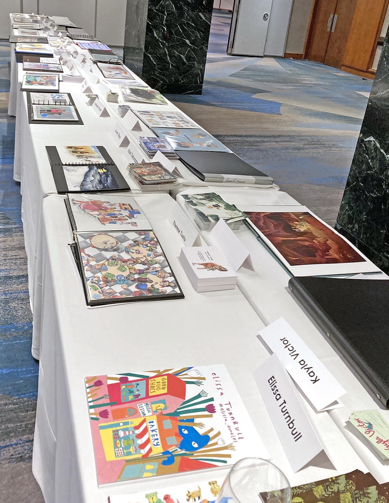
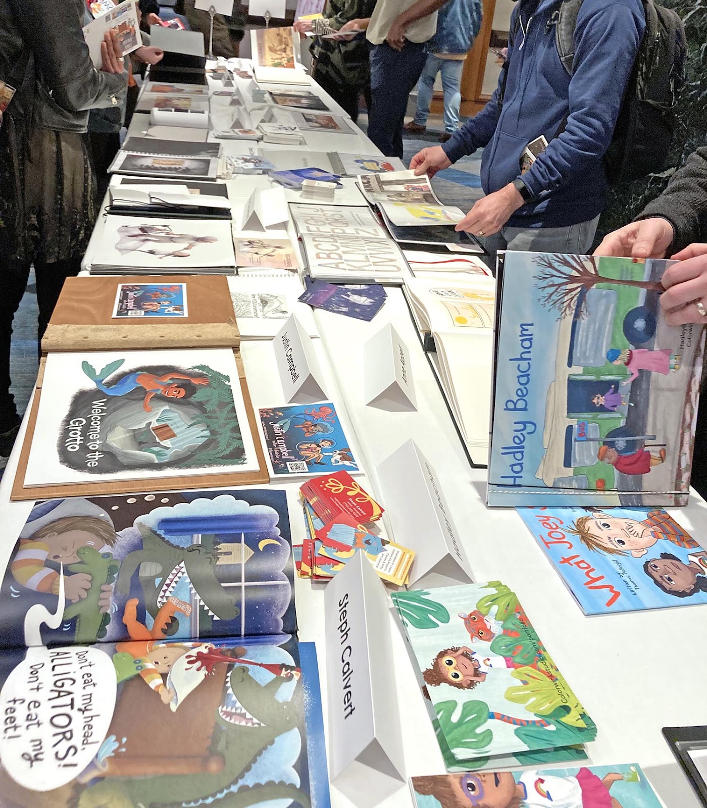
We can’t wait to see all your beautiful work!
Jen Boehler, Michigan Co-Illustrator Coordinator, is an illustrator, graphic designer and author working on a hobby farm in Saginaw, Michigan. Before pursuing children’s literature, Jen worked as a freelance editorial illustrator, graphic designer, interior/event designer and owned her own line of Michigan travel apparel. She has degrees in both art/graphic design and interior design.
Katie Eberts, Michigan Co-Illustrator Coordinator, received her BFA in Art & Design from the University of Michigan with a concentration in watercolor. Her debut picture book, Hush-A-Bye Night written by Thelma Godin, was published by Sleeping Bear Press in March 2023. She is based in Cedarville, Michigan.
Marvelous post, Jen and Katie! I'm sure MI Illustrators will appreciate your Portfolio Field Guide! I'm not an illustrator but I learned quite a bit!
ReplyDeleteJen and Katie, you presented this beautifully! So thorough and a great follow-up to Jay's post about the 2024 mentorship. Good luck to you Michkid illustrators as you prepare to shine!
ReplyDelete