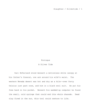
Strange that in an art form such as writing, especially writing for children, there is such a thing as standard manuscript formatting. We’d expect the rules to allow for fun fonts, experimental spacing, and coloured paper. Many publishing houses and magazines have guidelines that spell out exactly how to format your submission, but what about those that don’t? Does that mean they’ll accept any creative way you’d like to present your words?
Sorry, no. There is such a thing as standard manuscript formatting that most of the writing world adheres to. And while different publishers and agents may prefer slight variations on that, a clean professional manuscript in standard formatting allows your words to shine.
So unless your editor has a fondness for Garamond, or an agent wants you to format your cover page in a specific way, follow these guidelines. There are several sources out there, but the unifying factors are:
- font—Times New Roman is standard, in 12 pt. or another classic, serif font. There is a strong hatred for Comic Sans out there, so don’t risk sending your work out in it, even if you love it and don’t see what the fuss is about.
- one-inch margins
- double spacing (except for poetry)
- numbered pages
- byline
- header with name and address
- title/chapter heading centered half way down page
SCBWI’s The Book has an article and example on page 9. There are also numerous examples available online. Here are a few gold standards:
For picture books: https://www.writingpicturebooksforchildren.com/sample-title-page.html
 |
For novels, there is specific formatting for the title page: https://www.shunn.net/format/novel/
Each chapter begins half way down the page, and there’s a running header with the title/author/page number: https://www.shunn.net/format/novel/
For poetry: https://www.shunn.net/format/poetry/
One final reminder—standard formatting is for your final draft. Get those initial drafts and revisions down any way you like. I like to draft in block format, Cambria is my font of choice, and I print on coloured paper for my critique groups.
Questions? Put them in the comments and I’ll try and answer them.
Wendy's tips are just in time to help you finalize your submission to the SCBWI-MI 2020 Nonfiction Mentorship Competition! The submission window opens May 5th, and everything you need to know can be found here: https://michigan.scbwi.org/2019/10/23/non-fiction-mentorship-2020/


Thanks for the tips, Wendy. I haven't thought about submitting in a long time so this helped me know how to do it. Glad I already use Times New Roman 12 font. I'll bookmark this for future reference.
ReplyDeleteOh good, glad I got you thinking about subbing again, Natalie. :)
DeleteYour tips were very helpful. Thanks for sharing. I recently heard that Comic Sans was not a good choice for a font to use. I believe it was in a webinar, and was said the this particular font was over used in the past. Great info.
ReplyDeleteYou are welcome, and good luck with your submissions, Angela!
DeleteGreat resource, Wendy. Thanks so much. I recently saw a tweet thread started by well-regarded Lee & Low editor, Cheryl Klein about adding a page break after chapters in longer works.
ReplyDeleteCheryl B. Klein @chavelaque
Apr 16
Writers! When you finish writing a chapter, go to "Insert," then select "Page Break." Then start your next chapter on a new page. Do it for section endings as well, I beg of you. Keep your book neat.
Bryce M @robothyenas
Replying to @chavelaque
Is there a way to visually 'see' page breaks once inserted? I'm always second-guessing myself on if I've inserted them, or double-inserted them, or forgotten them.
Cheryl B. Klein
@chavelaque
Replying to @robothyenas
In Word, press Ctrl + *, or on the Home toolbar, click on the paragraph mark (the backward capital P). That will turn on all markings.
Yes, a proper page break! Thanks for adding that, Carrie.
DeleteThanks for sharing all! This is helpful.
ReplyDeleteSo welcome, Ashley!
Delete